Artist Statement
Form Follows Function: A Design of An Assyrian Identity
Artists of non-dominant cultures have an inherent responsibility to communicate a message that is genuinely personal yet able to transcend multilayered boundaries of identity. Being Assyrian, or a displaced person in the global world, I have strengthened my ability to examine, imagine, author, create, and produce art and tell stories through my visual explorations. My native language is the basis for all of my expression, yet as a person of a culture without a country, I am free to go beyond borders and artificial constructs.
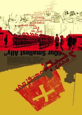
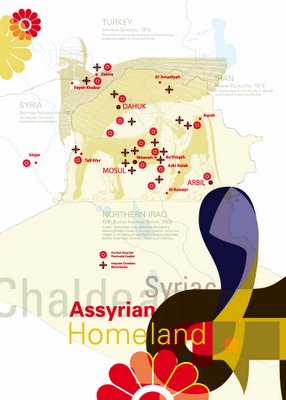
Graphic Design is a form of visual art that is concerned with the presentation and management of image and text as well as their relationships. Its primary function is to communicate by creating either a visceral reaction or to initiate an intellectual decoding process or both. The form of the neo-Assyrian alphabet, specifically Eastern Syriac letterforms, has a unique affect on my design sensibilities, as they are the core foundation of my semiotic coding of meaning. Assyrian is my mother’s language; what I heard in relation to what I saw visually and what I first coded and decoded, gives meaning to the world around me. I have chosen to examine the semiotics of this letterform along side ancient Assyrian patterns, by constructing and deconstructing their form. Through this investigation, the subject matter spans 20th Century Assyrian history, depicting an autobiographical connection to the subject.
Several unique observations have arisen, both visually and conceptually, through this investigation. The relationship of patterns and ornamentation is juxtaposed with abstract form and documentary content. Formation of a cluster of letterforms transform into a variegated visual repetition of patterns, utilizing historic and contemporary photos and text to document a specific aspect of 20th Century Assyrian history.
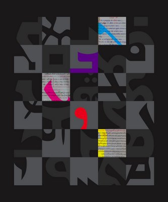
By cropping the form of each letter to its basic identifying feature, our relationship to letterforms is also distilled to its essence. Photographic scans are manipulated, including my childhood Assyrian notebook, along with Persian and English writing, examining their relationships, as a vehicle for learning my mother’s language, and symbolism of the letterforms. This abstraction of code allows for transcending the subjective where both Assyrian and non-Assyrian viewers can share in a profound and familiar experience; the development of an identity through language, form and culture.
Assyrian letters function as a visual tool through which I can express my design sensibility. The form of the letter holds who we are as Assyrians. Nothing can threaten the existence of this culture so long as the language remains. Despite all of the language deterioration, it is the alphabet, as the form of the language, which gives us our identity.
Sharokin Betgevargiz
MFA candidate in graphic design at Boston University
Sponsored by www.ZindaMagazine.com
With special thanks to professors Alston Purvis and Richard Doubleday, Colin Burke, Crest Graphics, Maegan BetGivargis-McDaniel, Eden Naby, my parents and the Donabed family.


